Mapping air pollution data and the distribution of publicly-managed trees in the London borough of Lewisham
Introduction
Air pollution in cities is a serious issue that seems to be growing in significance in
both public discussion and policy debate in the UK,
particularly in London. I wanted to make a map of tree distribution and air pollution
measurements to try and understand whether there might
be any easily discernible correlation between the two. I decided to focus on my home
borough of Lewisham, London.
This project was completed as part of a 10-week GIS and spatial analysis course I took
with the University of Oxford.
Methodology
I got the idea for the project after finding the incredible database of local authority
managed trees on the London Datastore
(https://data.london.gov.uk/dataset/local-authority-maintained-trees).
It has a data point for every publicly-managed tree in each London Borough. As well as
longitude and latitude, it has borough, species, age, height, span, and other useful
attributes for many of the trees.
Because this is my first project, I wanted to keep it relatively simple so I decided not to consider other attributes, instead using only the location of each tree. I also limited it to the borough of Lewisham where I grew up, as I hoped that it would make more sense to me if I stuck to an area I knew well.
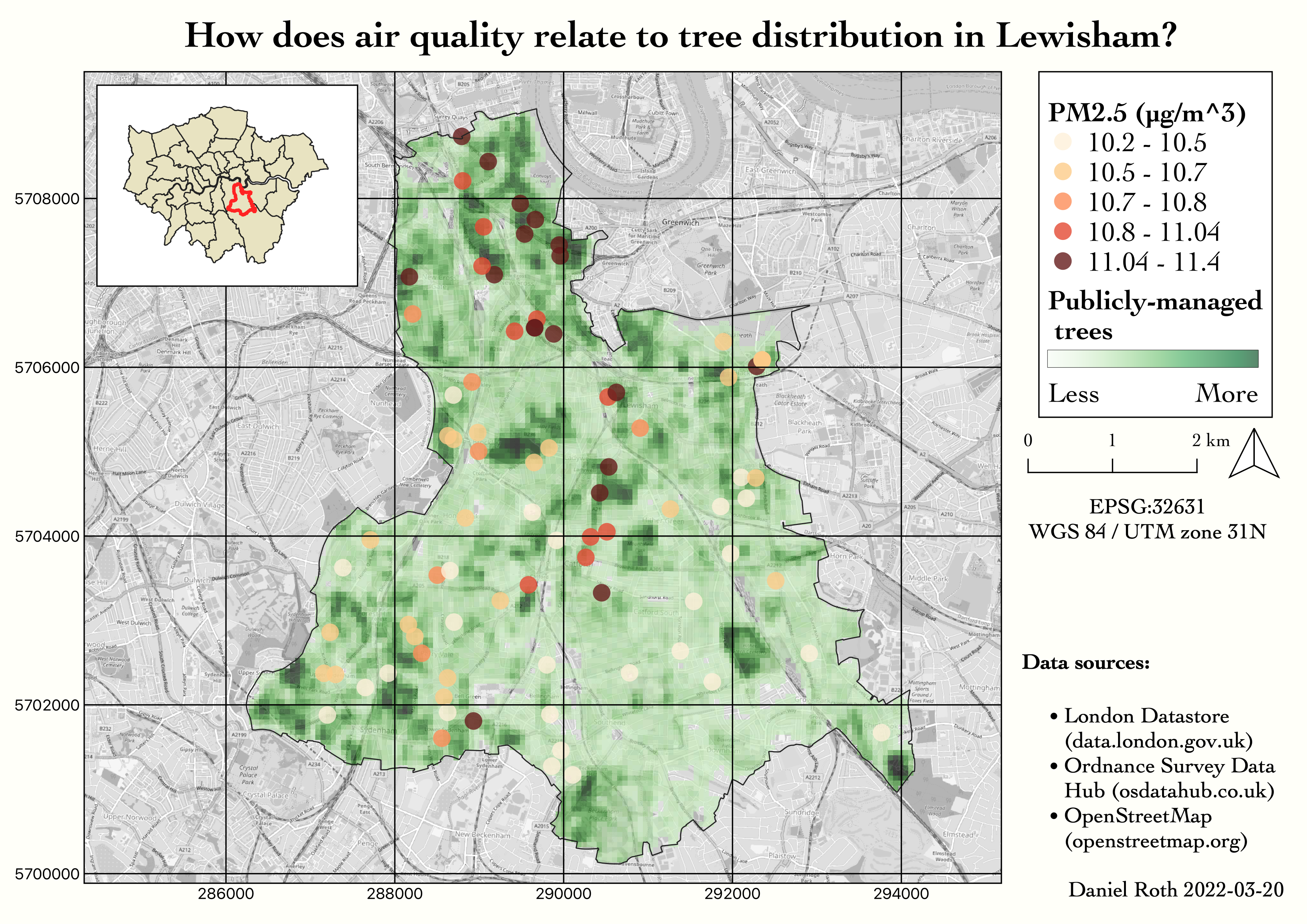
I downloaded the huge spreadsheet of trees and filtered it down to those in Lewisham, cut it down to only the columns I was interested in, and exported it as a CSV. I then imported it into QGIS as a delimited text file, and saved it as a vector layer with a CRS of WGS84/UTM zone 31N. To convert it to a heatmap I used the built-in Kernel-density estimation heatmap tool under Processing>Interpolation. I set a radius of 250m as I was I thought a larger radius would better help me show the spread of trees rather than dense clusters.
For the pollution data, I used the London Atmospheric Inventory database (https://data.london.gov.uk/dataset/london-atmospheric-emissions-inventory--laei--2019) which gives various data about air pollution at all education institutions in London. I again limited it to Lewisham and I decided to use the PM2.5 data as these are particularly harmful particulates. The locations of the schools were given in addresses, and unfortunately some of them were wrong so I had to manually correct many of them before using a geocoding website to turn them into lat/long. I then followed a similar method to handling the tree data to import the coordinates as vector data in QGIS. I used the Symbology tab to represent them as graduated by colour.
The boundary layers for the London boroughs were also downloaded from the London Datastore (https://data.london.gov.uk/dataset/statistical-gis-boundary-files-london) and the map is from openstreetmap.
Because this is my first project, I wanted to keep it relatively simple so I decided not to consider other attributes, instead using only the location of each tree. I also limited it to the borough of Lewisham where I grew up, as I hoped that it would make more sense to me if I stuck to an area I knew well.
I downloaded the huge spreadsheet of trees and filtered it down to those in Lewisham, cut it down to only the columns I was interested in, and exported it as a CSV. I then imported it into QGIS as a delimited text file, and saved it as a vector layer with a CRS of WGS84/UTM zone 31N. To convert it to a heatmap I used the built-in Kernel-density estimation heatmap tool under Processing>Interpolation. I set a radius of 250m as I was I thought a larger radius would better help me show the spread of trees rather than dense clusters.
For the pollution data, I used the London Atmospheric Inventory database (https://data.london.gov.uk/dataset/london-atmospheric-emissions-inventory--laei--2019) which gives various data about air pollution at all education institutions in London. I again limited it to Lewisham and I decided to use the PM2.5 data as these are particularly harmful particulates. The locations of the schools were given in addresses, and unfortunately some of them were wrong so I had to manually correct many of them before using a geocoding website to turn them into lat/long. I then followed a similar method to handling the tree data to import the coordinates as vector data in QGIS. I used the Symbology tab to represent them as graduated by colour.
The boundary layers for the London boroughs were also downloaded from the London Datastore (https://data.london.gov.uk/dataset/statistical-gis-boundary-files-london) and the map is from openstreetmap.
Discussion
Unfortunately I clearly haven't managed to show any correlation between tree density and
better air quality. Instead, I seem to have demonstrated that there is a higher level of
air pollution closer to
the centre of London. This makes sense, as it is where there is a higher population
density (something also shown by the fact I have more air quality readings closer to
central, meaning there are more
schools and therefore a probable higher population density).
I think my project could be improved by possibly taking into account other tree attributes such as age or height, as it seems reasonable to assert that larger or older trees might have more impact on air quality. It would also be sensible to research what species of trees are known to absorb the most particulates, and take this into account in the map as well. I would also like to learn more about air pollution and see how the map might look if I were to consider different readings (e.g. the pollution data included NO2 readings as well). It might be better to study a larger area than a single borough, although maybe it is very optimistic to think that there will be a clear correlation between air quality and tree density, as it ignores other factors such as traffic and wood-burners. I would also like to try to plot summer temperatures against tree spread as with heat waves increasing in frequency and intensity due to climate change, trees could be useful cooling tools; cities tend to be some degrees hotter than surrounding rural areas during times of peak temperature. I will first need to find some temperature data to a high enough spatial resolution.
I think my project could be improved by possibly taking into account other tree attributes such as age or height, as it seems reasonable to assert that larger or older trees might have more impact on air quality. It would also be sensible to research what species of trees are known to absorb the most particulates, and take this into account in the map as well. I would also like to learn more about air pollution and see how the map might look if I were to consider different readings (e.g. the pollution data included NO2 readings as well). It might be better to study a larger area than a single borough, although maybe it is very optimistic to think that there will be a clear correlation between air quality and tree density, as it ignores other factors such as traffic and wood-burners. I would also like to try to plot summer temperatures against tree spread as with heat waves increasing in frequency and intensity due to climate change, trees could be useful cooling tools; cities tend to be some degrees hotter than surrounding rural areas during times of peak temperature. I will first need to find some temperature data to a high enough spatial resolution.
Update
I wanted to try to improve the project, partly to see if I could find a better
correlation, but also just to get some more practice with QGIS.
The first thing I decided to do was to amend the heatmap to also take into account the trees in boroughs bordering Lewisham. This is because, with a relatively large radius of 250m when generating the heatmap, my understanding is that trees on the edge of Lewisham are at a bit of a 'disadvantage' as the heatmap colour in their location is not affected by trees that might sit just across the boarder boundary. To do this, instead of asking my computer to open the mammoth tree database spreadsheet again, I decided to export it to a CSV first and write a python script to filter out what I wanted to a new file. I put together the script quickly so I'm sure it's not the most efficient, but it works well enough for a CSV the size of the trees database (hundreds of thousands of rows)
I've embedded the code below
I also wanted to see whether I could take into account some of the other tree
attributes, but unfortunately so few of the trees had size or age data that the heatmap
didn't work when I tried to weight the
values by one of these attributes. For example, when I weighted the heatmap values by
tree hight (including trees in neighbouring boroughs but clipping the generated raster
layer to the extent of the Lewisham
boundary polygon):
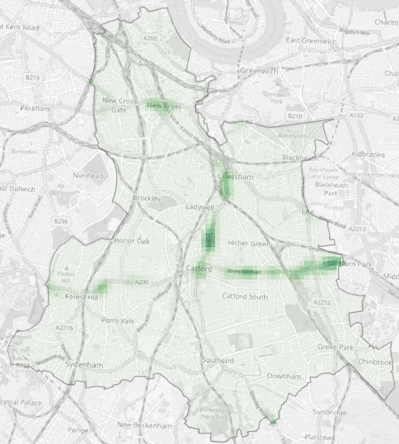
It seems like only trees on some major roads have had their heights measured. I
deliberated whether to fill in empty height values with an average value but I
decided it wouldn't be a good idea to start
manipulating the data in that way.
Instead of using other attributes from the trees data, I therefore decide to find out what else I could show from the air pollution data.
As mentioned above, the data set contained nitrogen dioxide levels as well as the PM2.5 readings which I used in the first version of the map
Instead of using other attributes from the trees data, I therefore decide to find out what else I could show from the air pollution data.
As mentioned above, the data set contained nitrogen dioxide levels as well as the PM2.5 readings which I used in the first version of the map
I used the same python script with different input parameters to re-filter the air pollution spreadsheet, this time saving the NO2 levels a well as the PM2.5. I imported the resultant CSV into my QGIS project and saved it as a vector layer with a CRS to match the project.
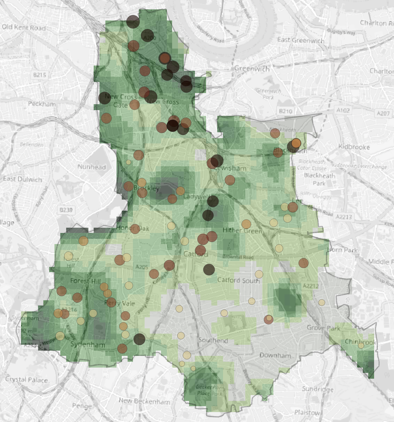
I wanted the pollution points to have their colour determined by one pollutant and
their size determined by the other. I therefore used a rule-based symbology. I used
the 'Add ranges to rule' option
to categorise the data by PM2.5 value and created a custom colour ramp from light
brown to dark. I then used the 'Change size' option and used the NO2 values as the
input source.
I also played around a bit with the heatmap generation - changing the number of rows and columns and the saturation and gamma values.
I also played around a bit with the heatmap generation - changing the number of rows and columns and the saturation and gamma values.